Rebranding Isn’t Just a New Logo. It’s about Business Strategy
A rebrand isn't just visual—it’s your business growth strategy. Explore how TCR builds identity systems that drive clarity, consistency, and performance.
BRANDING
Rebranding Isn’t Just a New Logo. It’s about Business Strategy.
When we tell you “rebranding isn’t just a new logo,” we mean it. At The Creative Roots Studio (TCR), a rebrand is a full-scale business strategy. It’s identity design that speaks to your market, tonality that deepens your voice, and brand DNA that becomes your strategic compass—all aligned with your business goals.
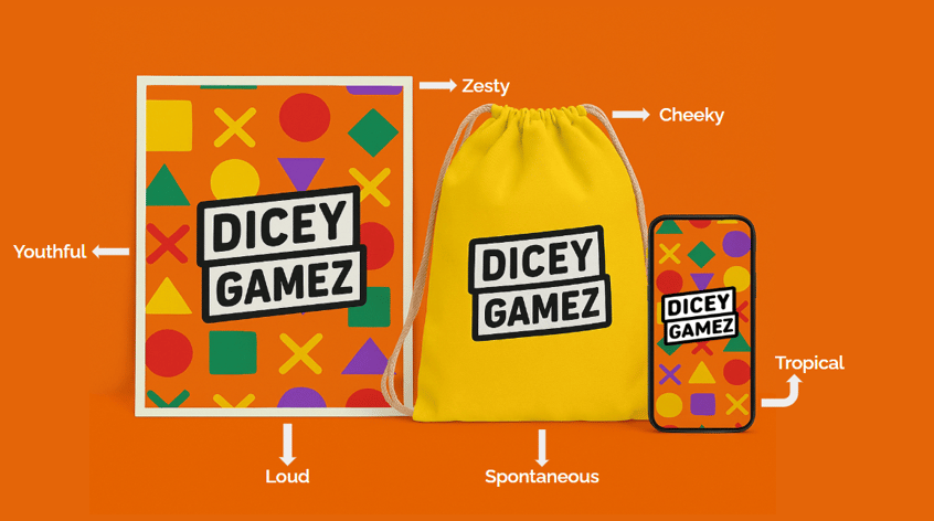
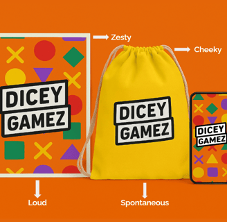
A logo is only part of the visual surface—think of it as the hit single on your album. But identity design is the whole record: typography that feels intentional, color palettes that trigger the right emotional resonance, patterns or illustration styles that act as visual shorthand. TCR begins by excavating your brand DNA—your mission, values, differentiators—and translating those into visual languages that work across every touchpoint. We don’t just sketch a wordmark. We build a creative identity system that supports you through expansion, new product lines, and evolving market demands.
Next is tonality and voice. Words matter. When your brand voice shifts from “meh, business-as-usual” to something more strategic—say, confident but empathetic, authoritative yet approachable, or clever without being cutesy—your audience listens differently. TCR’s team works closely with your leadership and marketing squad to define how your brand speaks: in headlines, product copy, email campaigns, social captions, even in-system messages. We define guidelines: are you using contractions? Should there be subtle humor? When do you flex formal authority versus warm encouragement? Because misaligned tone isn’t just jarring—it undermines trust.
Effective rebranding aligns tone with intention. Are you witty and authoritative? Reassuring and sincere? Aspirational but grounded? That tone gets echoed in everything: your homepage headline, your product descriptions, your Instagram captions. And consistency here is gold. Because when tone matches visual identity, the whole brand starts to feel more… real.
This is also where visual consistency comes in. Many rebrands fall short not because they look bad, but because they behave inconsistently. One post uses minimalist linework, the next is splashed with maximalist gradients. One web banner whispers elegance, the next screams sales. Strategic branding demands a cohesive visual rhythm. Your packaging should echo your website. Your social should echo your product UI. Repetition builds recognition. Recognition builds trust.
Speaking of UI—branding and user experience are inextricably linked. A rebrand that doesn’t factor in digital behavior is like redesigning your store’s exterior but ignoring the checkout counter inside. Your identity should live inside your digital product, not just around it. That means consistent use of typography, meaningful hierarchy, brand-aligned interactions, and micro-animations that feel on-tone. It means making sure your visual storytelling doesn’t get in the way of usability—but guides it.
Here’s where subtle motion branding also plays a role. Think interactive transitions, hover effects, or micro-videos that reinforce your product promise. These aren’t gimmicks—they’re emotional cues. The difference between a static image and a short looping demo can often be the difference between curiosity and conversion.
And let’s talk strategy: a solid rebrand is an investment—but a well-placed one. While it might not always produce instant overnight spikes, brands that commit to a clear identity system often see a long-term return on investment. That ROI might come through improved brand recall, lower customer acquisition costs, or the ability to charge premium prices without hesitation. According to industry reports, companies that maintain consistent branding across channels increase revenue by up to 23%. That’s not magic. That’s clarity, repeated.
Of course, pulling off a rebrand isn’t just about creative intuition. It’s about cross-functional alignment. Your marketing team might be focused on storytelling; your product team on usability; your leadership team on growth. A successful rebrand creates a framework that supports all of them. It bridges departments. It gives the sales team better decks. It gives the UX team design tokens. It gives the founders peace of mind.
The Creative Roots Studio understand this layered complexity. While we don’t claim to overhaul your business, we do something crucial: connect the dots. Through a mix of design thinking, tone exploration, and motion strategy, TCR builds rebrands that don’t just look better—they work harder. And while we focus on sharp visuals, it’s the behind-the-scenes thinking—the “why” behind every pixel—that makes our work tick.
Ultimately, rebranding should feel like leveling up. It should take everything you already are and shape it into something more focused, more intentional, more memorable. Not a different version of you, but a sharper one. When your tone of voice, visual identity, UI presence, and motion strategy are all aligned, your brand doesn’t just show up. It resonates.
Because in the end, rebranding isn’t about starting over. It’s about saying the same thing you’ve always believed—just smarter, clearer, and with way better lighting.
Ready to Rebrand With Purpose?
Get in touch.
We don’t do logo makeovers.
We do brand transformations that work harder for your business.